One of the big points I make about SharePoint Team Sites is that they are designed for collaboration rather than just storage. This means Team Sites are typically designed to contain not only files but contacts, lists, calendars and so in a structure that make sense for the business. The way many refer to it is as an ‘Intranet’, i.e. a web site full of information (not just files).
Microsoft is preparing an update to Team Site Document Libraries which I believe discourages the core of what Team Sites are all about, that is, collaboration.
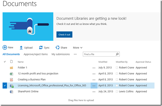
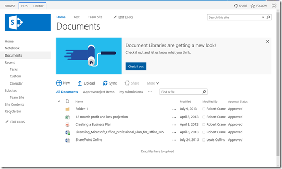
When you visit a Document Library in a Team Site now you’ll see the above message asking you to Check it out.
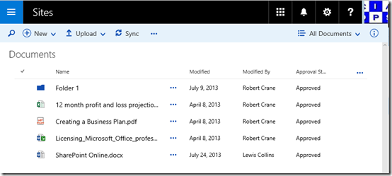
When you do, you see the new interface as shown above. You’ll note that Document Libraries appear very much like the new OneDrive for Business interface.
Problem for me is that I believe this silos information. The new interface is fine for OneDrive for Business because that is effectively a silo for each users own ‘stuff’ but in a Team Site it doesn’t make sense to me because they are designed to be accessed by multiple people.
If you compare this to the ‘classic’ interface above, you can see how many more options the ‘classic’ interface provides. It allows you to see the whole structure, other elements, all the navigation options as well as any theming.
The new interface basically takes you to a place where you only see a simplified version of the files in that Document Library. That isolates, or silos you from other information and effectively prevents collaboration I would suggest.
I appreciate the desire to have a simpler interface for average users but if we go down the path of wide spread adoption of this new interface it is simply going to reinforce the notion that SharePoint Team Sites is nothing more than a file repository, a dumping ground for files if you would.
As I said, I think the new interface is fine for OneDrive for Business but I don’t feel it is appropriate for Team Sites, because these should be designed for encouraging users to share, not taking them to places where they can only see a small subset of the information.
I would also contend, that having this new interface also creates a marked difference between the ‘normal’ Team Site interface and Document Libraries. That difference makes it harder for users to understand and work with because it is inconsistent.
In short, I don’t this new Document Library look and feel is going to help Team Sites be more about collaboration. I fear it simply reinforces the current perception that Team Sites are just old world network shares in the cloud, which they ain’t!


