As outlined in a recent blog post from Microsoft:
Introducing a new home page experience for Office 365 users
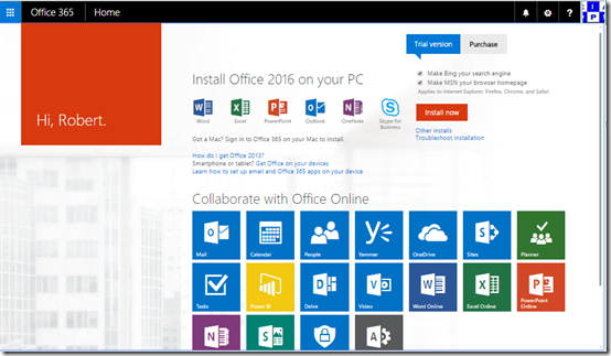
things are going to start looking rather different for users when they login to the Office 365 web portal. Above you can see how it is currently,
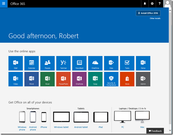
and here you can see what the new experience looks like. Much cleaner. It will also report that the page is far more ‘mobile responsive’ in that it scales and adjusts to window size much better.
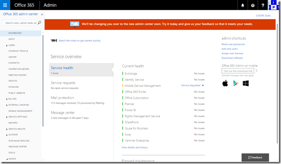
Also, if you are an Office 365 administrator you are probably familiar with the ‘classic’ interface for managing things shown above. However, a while back Microsoft again announced that a new look and feel is in preview for the Admin center:
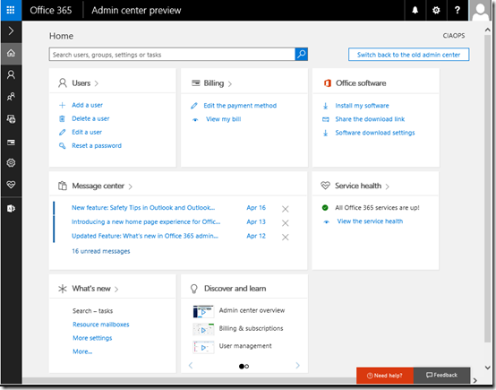
The new Office 365 admin center preview
which you can now see above.
The changes to the UI a excellent, I gotta say. They make things much clearer, less cluttered and have a much ‘nicer’ look and feel. This is going to help users work (and I would suggest adopt) Office 365 more readily, especially when you compare how Office 365 now looks to other cloud based systems.
I would also point out that if you are an IT reseller who is only doing administration for your customers using the web portal then I reckon it is only a a matter of time before customers decide they can do this for themselves. Honestly, in my opinion, the web console is aimed at end “power” users not resellers.
I would therefore suggest that IT resellers should be doing most of their regular administration via PowerShell for a variety of reasons (the biggest being automation).
Although these interface changes can be a little jarring to some not used to the rapid change in the cloud, they definitely improve the service, make it more appealing for existing and new users and best of all, existing Office 365 users get it for free!
Unfortunately for me personally it means I got to redo my publications, but hey, everyone needs a hobby right?


